Wednesday, February 19, 2014

Project 2 Reflection and Comparison: 2/19/14

So here we are, at the end of my 1st complete project. Granted for me, this project was extremely frustrating and stretched my drawing ability to the absolute limit. It was tough but I did it and got results I was satisfied with. So let's take a look of the comparison of my drawing and the original photo.

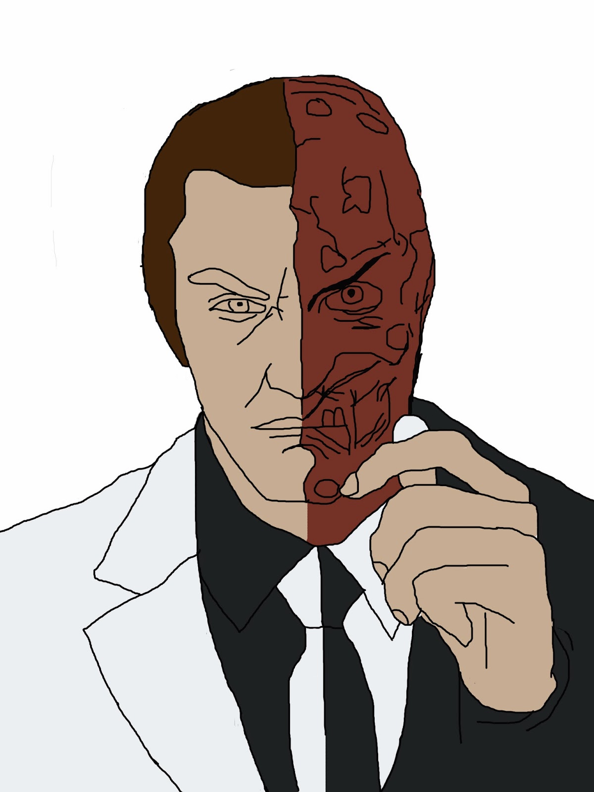
 Original is on the left, Mine is on the right


Obviously the biggest difference is the smoothness of the lines in the original. In my picture the lines are rigid and I suppose sloppy? Maybe sloppy isn't the right word but I think you get what I'm saying. The biggest difference has to be the suit. The suit is easily the worst part of  my picture. The lines aren't as thick and are really sloppy (Sloppy is the right word in this case) The skin color is also slightly off (Which is odd since I copied it using the eyedropper tool. Once again I admit defeat on that front) but overall for my 1st big drawing that I truly believed I had the skills to do I'm really satisfied with the results.

Obviously there is room for improvement but the result was good. Now on to my next project. I will be drawing Archer in the photo below. Haven't cut him out of the overall picture yet but the plan is to draw him. It has a lot more shading and overall is more complex than the last. Not sure how this will turn out but I'll give it a shot and complete it to the best of my abilities.

Project 2 Day 3: 2/19/14

So I finally finished up the highlights and the eyes. I surprisingly actually like the finale product a lot. I could have done a little better on the outline on the suit but I'm going to save those thoughts for the reflection and comparison I do next time. For now, here's the final drawing below

Friday, February 14, 2014

Project 2 Day 2: 2/14/14

So with the overall outline done I was ready to add color. Before going on any further I will admit defeat and say I couldn't find the right skin tone. So I opened my reference picture in Photoshop and used the eyedropper tool to get the color. I know, criminal but I wasted about 15 minutes trying to get the right skin tone and my frustration was at very high. Now with that out of the way lets continue on.

Overall I'm pretty satisfied with the coloring of the project. Kind of looks creepy with out the eyes but I plan on adding those last. With the time I had I wasn't able to get to the eyebrows so I'll do that before moving over to the highlights in the hair and the shading. The highlights in the hair is what is really going to make this look great so I expect it to be very time consuming.


Wednesday, February 12, 2014

Project 2 Day 1: 2/12/14

So my whole plan has revolved around being able to improve my drawing skills to the point where I'm confident enough to make a solid animation. Project 1 was pretty much just a practice project I guess you can call it. Pretty much felt I did the best I could do on that project. Biggest problem was that the tutorial was going for this ultra realistic look I suppose. My animation probably won't look ultra realistic... probably

With the animation goal in mind I wanted to draw and finish something from an Animation. What better thing to do than Sterling Archer? So for pre production I hand drew a rough draft. Was pretty solid so I felt I didn't need to add the color to that draft. Could have easily just scanned the picture in but I wanted to draw it again in photoshop. More practice I suppose. Picture of the overall outline below.

I figure this project should take 3 days to complete. One for the outline, one for the color, and one for the highlights.


Thursday, February 6, 2014

Day 3 2/6/14

I was able to put in the prelim colors of the painting. Wasn't able to fix up on the actual drawing which is a little disappointing but I should be able to do that before I start adding in some shadings.